FRAMEWORK
How Great Subscription Offers Are Built
The buy box decides your retention before month one: the evergreen design rules, four offer structures worth stealing, and the line between confident and sneaky.
Written by The Cancel Page
Every subscription program has one page that quietly sets its retention curve, and it is not the cancel flow. It is the product page, specifically the few hundred pixels where a shopper chooses between buying once and subscribing. By the time anyone reads your billing reminder or your exit survey, the shape of your churn was mostly decided here.
Most brands treat the buy box as a pricing widget: two radio buttons, a percentage, done. That is the mistake. The buy box is an offer, the offer is a promise about the relationship, and the brands that win subscriptions design it with the same care they put into the product. Here is the anatomy: the parts every great one shares, and the offer structures worth stealing.
Three pillars, one lever
Every subscription program stands on three numbers. How many subscribers you bring in. How much each of them spends per order. How many times they renew before they leave. That is the whole machine; every metric on your dashboard is some combination of those three.
Almost everything you can test moves one pillar at a time. Ads and landing pages move the count. Upsells move the order value. Onboarding, billing reminders, the cancel flow: those work on renewals. All useful, but each lever pulls one rope.
The offer is the exception. It is the only place in the entire lifecycle of a subscription where a single test can move all three pillars at once. A better buy box converts more of the same traffic into subscribers. The right structure (a bulk supply, a loaded starter kit) puts more into that first order. And a subscriber who chose a three-month supply doesn't face their first renewal for ninety days, by which point the product is a habit. The best offers get more people, get them to spend more, and keep them around longer, from one test on one page. And the results show up in your conversion rate in days, not quarters.
That is the whole case for obsessing over the buy box, and it is why we keep a running Offer Library of live subscription offers. The fastest way to find your next test is to watch what working brands are shipping. And when you'd rather ask than browse, Ask The Cancel Page is trained on the same teardown corpus these examples come from.
The evergreen anatomy
Offer structures come and go. These parts don't.
- Subscription first, not subscription only. A subscriber is worth two to three times a one-time buyer over their lifetime. If the subscription option isn't the first thing presented, pre-selected, and visually dominant, the page is optimized for your least valuable customer. But first doesn't mean only: delete the one-time option entirely and you hurt both ends of the machine. Shoppers who wanted a trial run bounce, so the traffic you paid for converts worse and your acquisition cost climbs. The ones who subscribe without realizing it churn angrily the moment the second charge lands. Default to the subscription; keep the exit visible.
- Make the subscribe box the loudest thing on the page. Give it a contrast color the rest of the template doesn't use, a "Most Popular" badge, a border that says this one. Flaus (an electric flosser with floss-head refills, and one of the longest-running high-performing buy boxes in the space) does this so well the page has barely changed in three years. That stability was earned by testing into it, not by shipping the first version and hoping.
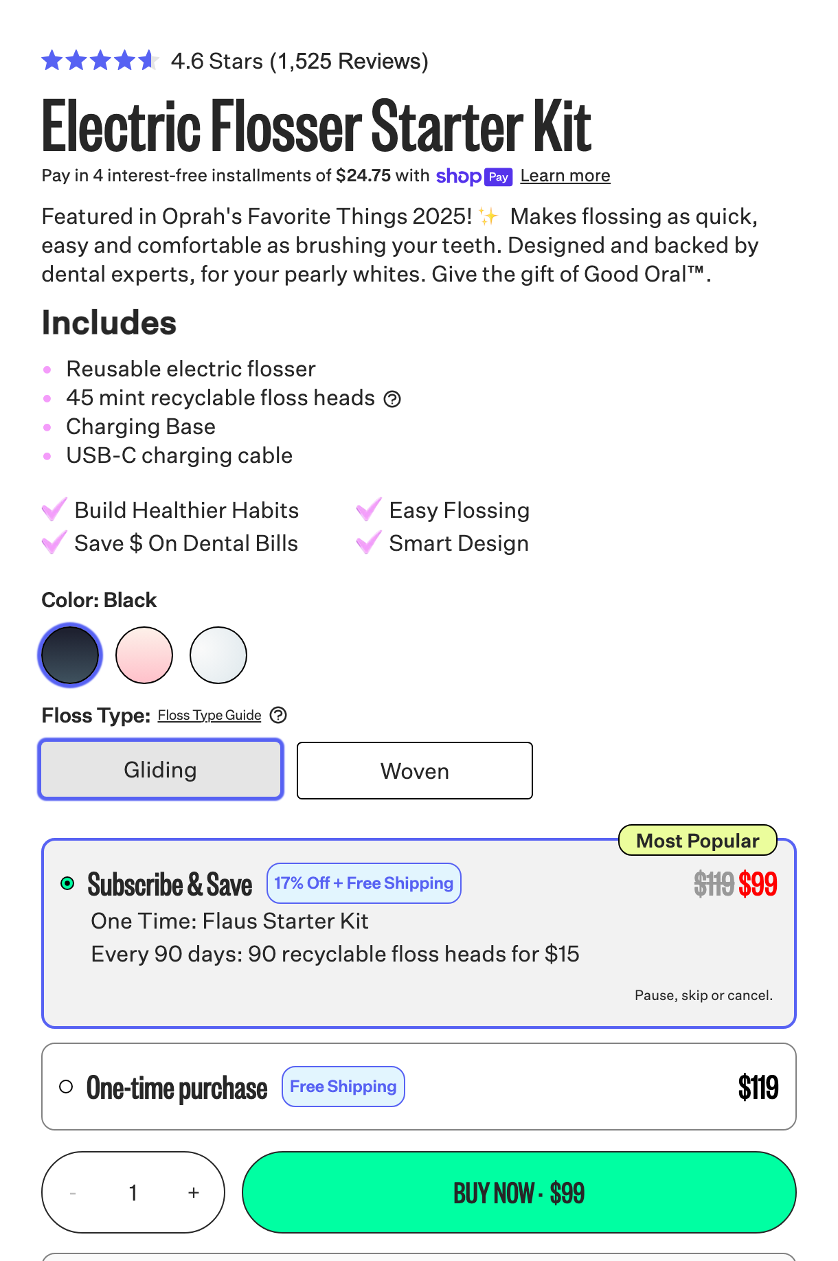 Flaus: the subscribe option carries the badge, the contrast color, and the math; the one-time price is visibly the worse deal.
- Show the math. Strike-through price, percentage saved, per-unit cost, free shipping, spelled out rather than implied. Indacloud's gummies page updates the price-per-gummy live as you change pack size, so the value of the bigger pack is never an act of faith.
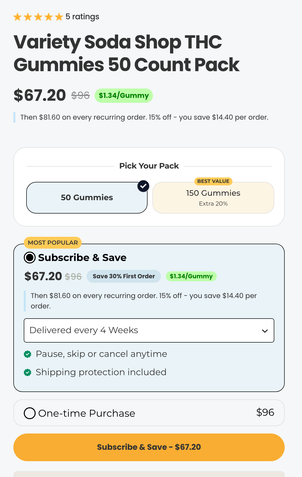 Indacloud: pick a pack, watch the per-gummy price drop. The subscribe box is the only colorful thing in the frame, while one-time purchase sits below in plain grey.
- Show everything that ships, and when. This matters most when the subscription isn't self-explanatory: a device plus refills, a starter kit plus consumables. Flaus lists exactly what's in the first box and what arrives on each refill cycle, which is why a genuinely confusing offer (buy a flosser, subscribe to floss heads) converts like a simple one. Leave the mechanics vague and the confusion doesn't stop the purchase; it surfaces six weeks later as a cancellation with a grudge.
- Make choosing one-time feel like leaving something behind. The one-time option should exist, clearly, but styled plain while the subscription carries the value. The Pause Life does the sharpest version: click one-time purchase and the subscriber perks visibly drop away. Checkmarks become a red X, the discounts shrink, the prices jump. The shopper doesn't read about the loss; they watch it happen.
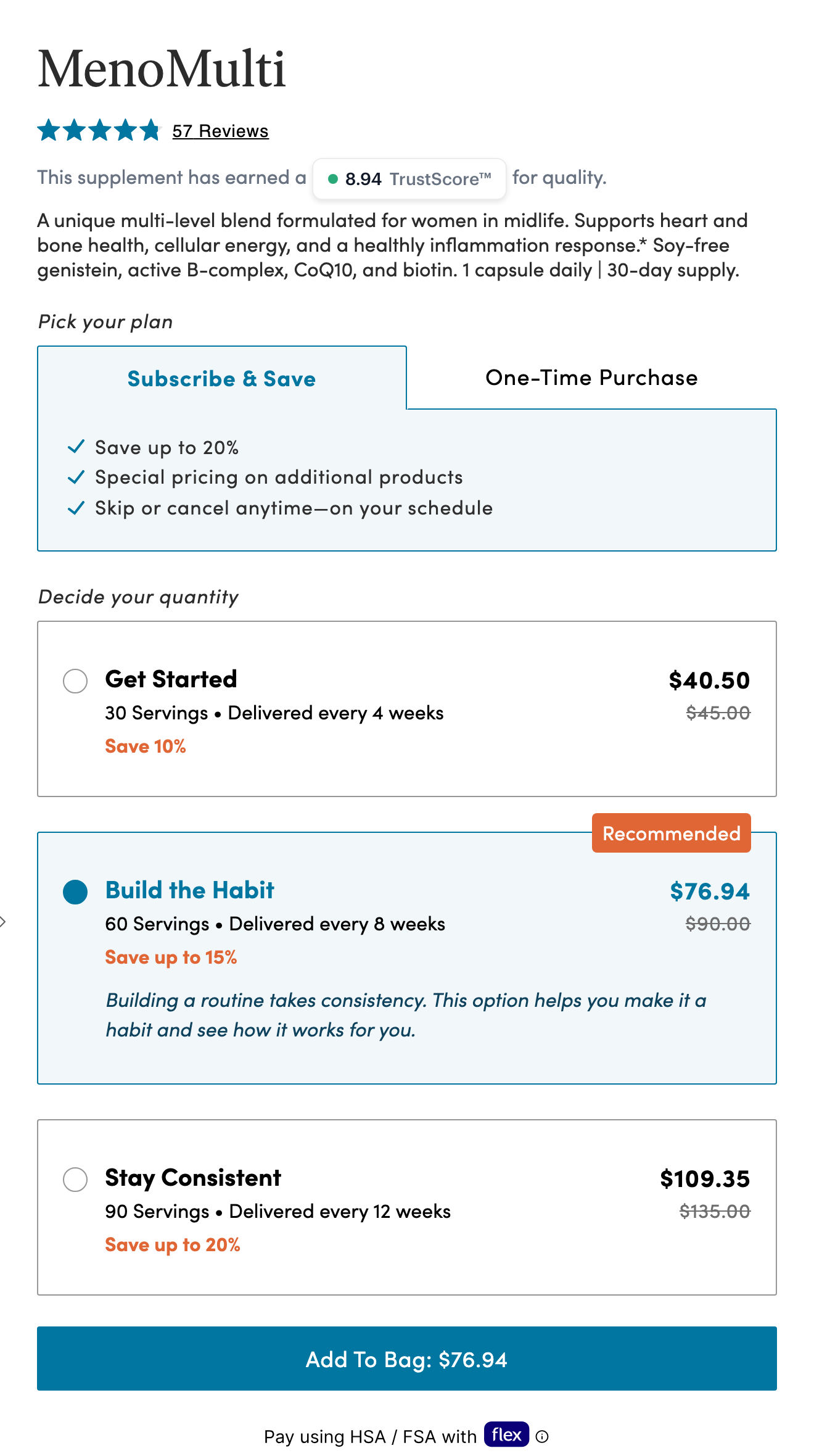 The Pause Life, subscribing: three checkmarked perks and up to 20% off across the supply tiers.
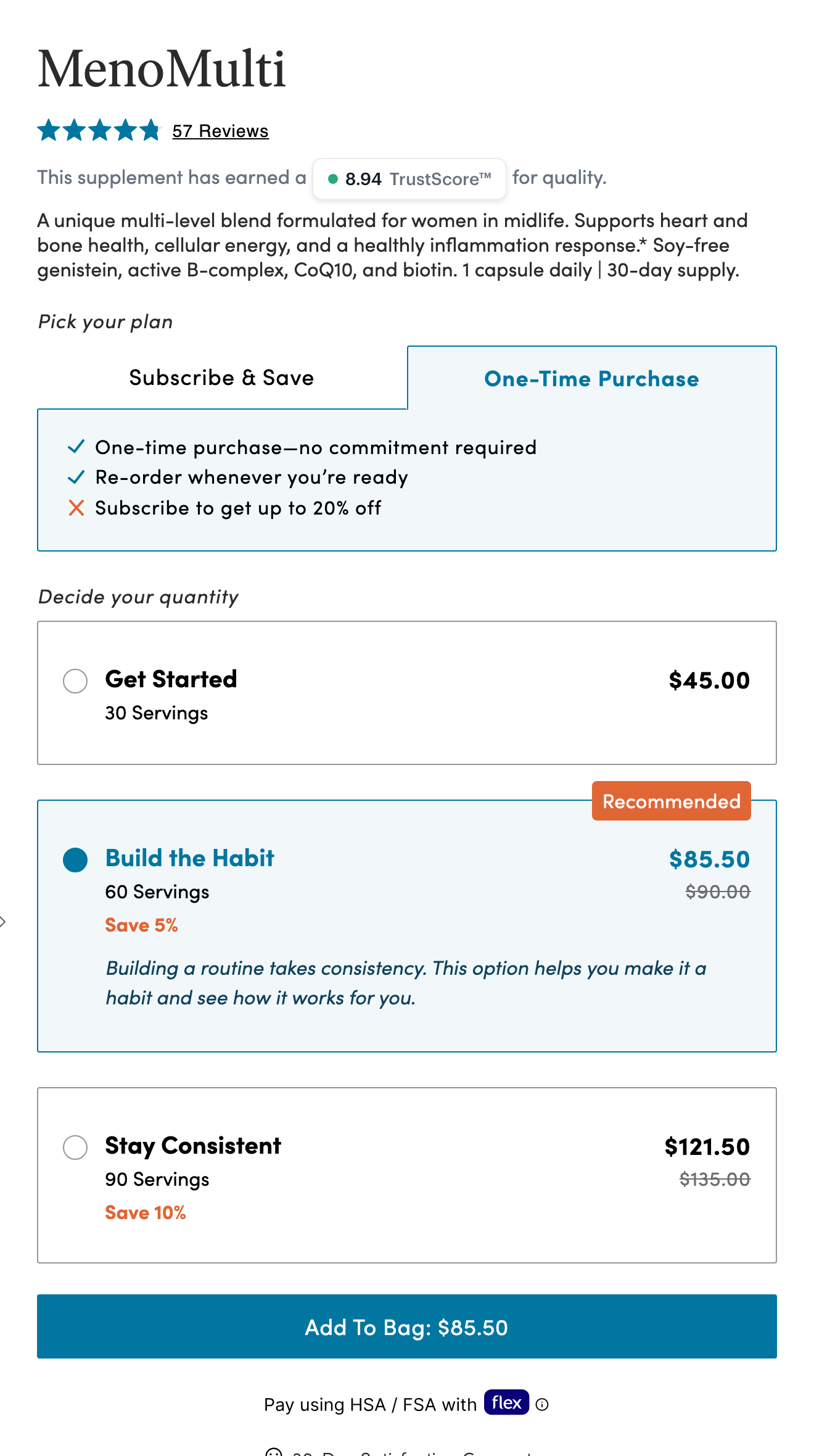 The same box after clicking one-time: a red X where the perks were, discounts cut in half, every price higher. Nobody has to explain the trade.
The offer structures worth stealing
The anatomy above is the floor. The structure, what the offer actually is, is where the interesting testing happens. Four patterns keep earning their place, and the Offer Library tracks live examples of each. None of them transplants blindly, though: each works because it matches how its product is bought and used, so steal the mechanic, then test it against your own economics.
Bulk: sell the three-month supply
The strongest trend in subscription offers right now is bulk. Instead of one subscribe-and-save option, the buy box offers a one, three, and six-month supply, with the discount deepening as the supply grows. Respire runs the clean version: 10% off the monthly supply, 40% off three months, 50% off six, with the badges steering you toward the bigger tiles.
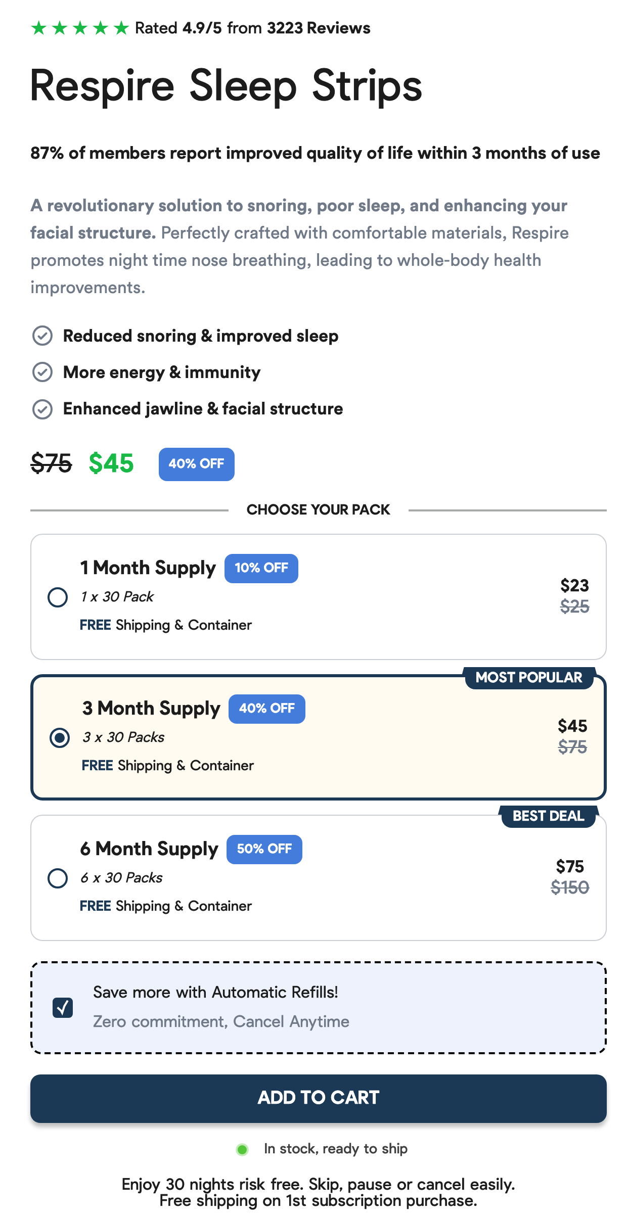 Respire: the discount deepens with the supply (10%, 40%, 50%), and the one-time option is reduced to a pre-checked box you'd have to deselect.
LifeSeasons does the same with more motion: pick a bigger supply tile and it fills with color, expands its list of perks, and reprices the two buttons below. Subscribe-and-save sits in a solid fill, one-time purchase in a quiet outline, the hierarchy doing the persuading.
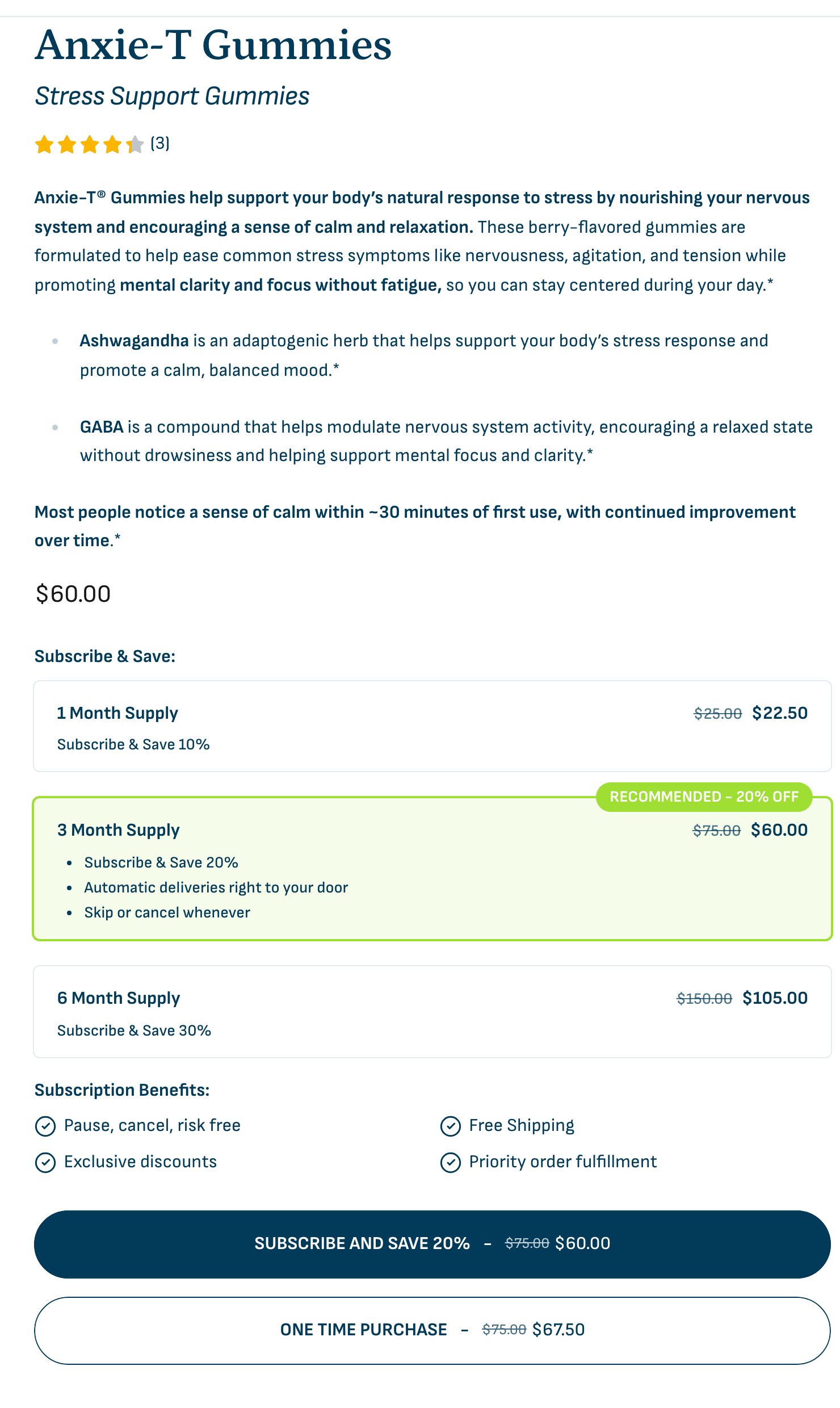 LifeSeasons: selecting a supply tile fills it with color and unfolds its perks. Then the solid subscribe button outranks the outlined one-time button.
The reason bulk works has nothing to do with average order value. A subscriber's hardest renewal is the first one, and someone on a three-month supply doesn't face it for ninety days, by which point the product is part of their routine. Get even 10 to 15% of new subscribers onto a multi-month supply and the renewal rate of the whole cohort moves. It is the rare acquisition tactic that is really a retention tactic wearing a different shirt.
The starter kit: one great offer, then upgrade
Men Go To Mars runs the opposite play: no grid of options, just one clean, loaded offer: the starter kit, with the discount, the free gifts, and a percentage off for life, all listed in the box. The simplicity is the point. Then, post-purchase, they work on converting the monthly subscriber into a multi-month one, including inside the billing reminder itself, which is exactly where an upgrade offer reads as service instead of a squeeze.
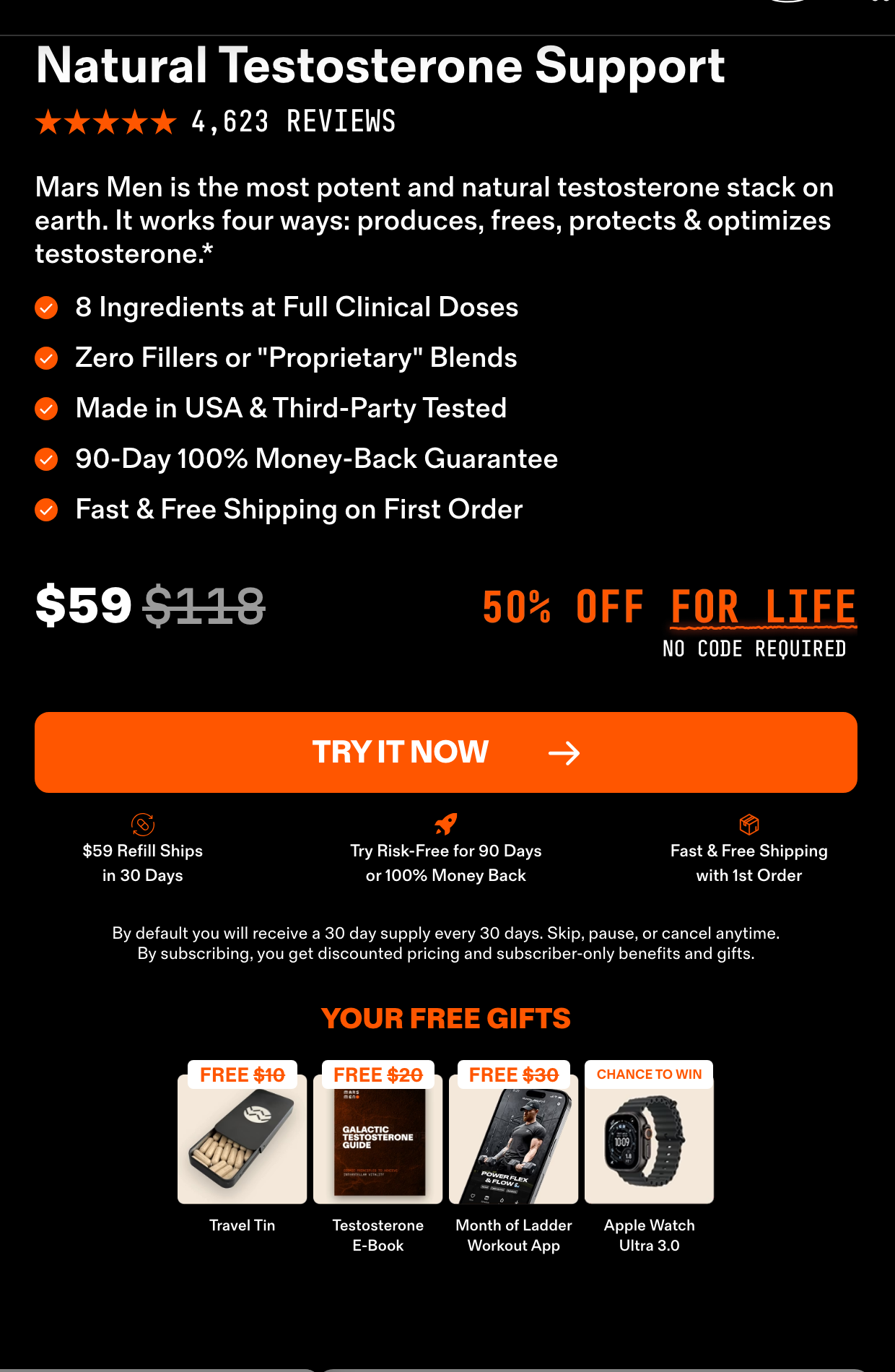 Men Go To Mars: one offer, fully loaded: discount, free gifts, and a rate locked for life. The upsell to multi-month happens after the purchase, not during it.
Buy more, get more
HumanN names its multi-month tiers buy 2 get 1 free and buy 4 get 2 free. The percentage is still printed on the tile, but it isn't the headline. A free bag is concrete in a way "40% off" never is, and it changes what the shopper is weighing: not how much do I save but what do I get.
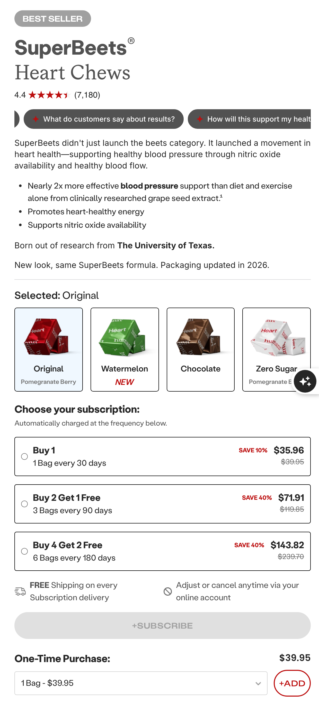 HumanN: the multi-month subscription expressed as free product first, percentage second. Rarer in the wild, and worth testing for exactly that reason.
Gifts you unlock
Elavate gamifies the ladder: the more bags you buy, the more free gifts unlock. The buy box shows the whole gift grid, earned items unlocked and the rest sitting behind little padlocks. The one-time option is tucked to the side, still available; it just earns none of the gifts. Unlock mechanics almost never appear outside bundle builders, which makes this a genuinely differentiated page in a category full of identical percent-off grids.
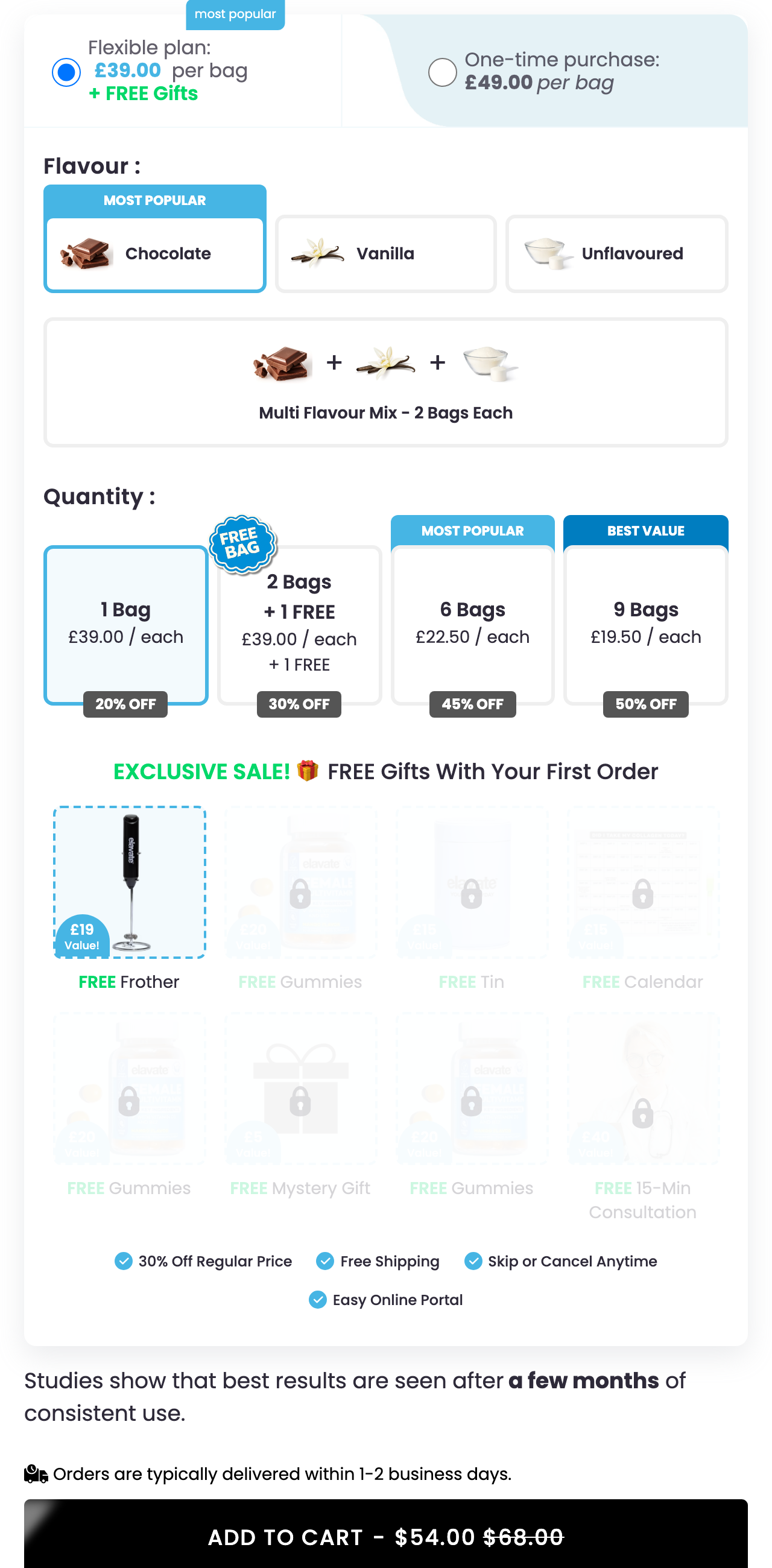 Elavate: every step up the ladder unlocks another gift, and the padlocks show you exactly what you haven't earned yet: the buy box as a game the shopper wins by committing.
The thread through all four: value stacking beats discounting. A percentage is the offer every competitor can copy by Friday, and discount seekers never stay. The moment the product is cheaper somewhere else, or they simply run out of curiosity, they're gone. A gift with purchase, a free month, an unlocked tier costs you less than the equivalent percentage and attracts people who want the product rather than the deal. Run your discounts; just don't let them be the only offer you know how to make. When you need fresh ideas, the Offer Library is stocked with what's live right now, searchable by structure.
How hard you can push
Several of these pages flirt with the same edge: making the one-time option hard to see. Respire reduces it to a deselect. Elavate tucks it to the side. And it works: hiding the one-time option is the single easiest way to inflate your subscriber opt-in rate.
It is also the easiest way to acquire subscribers who don't know they subscribed. Those show up eight weeks later as support tickets, chargebacks, and one-star reviews, and no save flow rescues someone who feels tricked. The distinction that matters: bulk options genuinely improve first-renewal retention; burying the one-time button only improves the number on your dashboard. There is a sweet spot between a timid page and a sneaky one, and the honest test is whether a distracted shopper on a phone knows what they just agreed to. Design up to that line, not past it. If you're not sure which side of it your page sits on, describe your buy box to Ask The Cancel Page and see what it flags.
Score every test against the three pillars
Judge every buy-box change the way you'd judge the whole program: did it bring in more subscribers, did it raise what they spend, did it stretch how long they stay? Most tests move one of those numbers. The offers in this guide earn their place because they move all three at once: the bulk tier that converts the shopper, raises the order, and defers the hardest renewal by ninety days; the starter kit that loads the first purchase and locks a rate worth keeping; the gift ladder that earns commitment instead of discounting for it.
None of it requires inventing from scratch. The Offer Library holds the live buy boxes working brands are running right now, searchable by structure, updated as they change. And when you want an answer rather than examples (what to test first, which structure fits your product, whether your page has crossed the sneaky line), Ask The Cancel Page and get one in plain English.
The brands winning subscriptions are not the ones with the deepest discount. They are the ones whose buy box makes committing feel like the obviously better deal: more people in, bigger first orders, longer stays. Three pillars, one page, one test at a time.